Introduction
This vignette walks you through our Single-cell Sample-Level Integration using Density Estimation (scSLIDE) workflow, a novel computational method that performs sample-level analysis for single-cell data. Given multi-sample single-cell disease data, this workflow first obtains a cell-type-oriented embedding (via reference mapping or unsupervised dimension reduction) and a disease-oriented embedding (via supervised learning). It then constructs a joint embedding from these two embeddings so that cells are embedded into a joint space where their distances reflect both cell-type and disease-state similarity. Next, we adopt the landmark-based strategy (originally proposed by Yi & Stanley et al bioRxiv), using a randomly sketched subset of cells (‘landmarks’) to quantify cell density near each landmark for each sample. We end up with a landmark-by-donor matrix whose entries represent the cell density near each landmark for each donor. Sample-level analyses such as pseudo-trajectory inference and pseudobulk differential expression testing can be performed based on this sample-level object (also shown below).
Setup and Library Loading
First, we load all necessary libraries and set up the working environment.
# some other packages that will be used in this vignette can be installed using the following commands:
# devtools::install_github("satijalab/AzimuthAPI")
# devtools::install_github("xmc811/Scillus", ref = "development")
# BiocManager::install("destiny")
# install.packages(c("princurve", "ggridges"))

library(Seurat) # make sure this is the scSLIDE-compatible version
library(scSLIDE)
library(AzimuthAPI)
library(princurve)
library(ggplot2)
library(ggridges)
library(Scillus)

# set the future.globals.maxSize to 5GB
options(future.globals.maxSize = 5 * 1000 * 1024^2)
Data Loading and Initial Processing
We will use a subset (~104k cells) from Ahern et al 2022 Cell as an example for our workflow. This subset can be downloaded from this link. This dataset consists of 40 donors: 10 healthy controls (‘HV’) and 10 patients from each of 3 different COVID severity groups (“MILD”, “SEV”, “CRIT”).
object <- readRDS("Raw_count_Subset_104k_Ahern_2022_Cell.rds")
object <- NormalizeData(object) Cell Type Annotation with Azimuth
We use the pan-human Azimuth cloud tool to annotate our data and obtain cell-type-oriented embedding. Alternatively, users can employ methods like PCA or different integration methods to obtain such embedding, and later manually annotate the cell types.
object <- CloudAzimuth(object)

# Get the top 2000 highly variable genes
object <- FindVariableFeatures(object, nfeatures = 2000)
Prepare the Single-Cell Data for Sample-Level Analysis
To perform all necessary pre-processing steps, we provide a wrapper function called PrepareSampleObject(). This function prepares a single-cell Seurat object for downstream sample-level density analysis. It (optionally) identifies additional highly variable genes through correlation testing, creates training and landmark cell subsets via sketching methods, performs PLS learning to capture response-relevant variation, and constructs a weighted multi-modal nearest neighbor graph between landmark cells and the full dataset. The function outputs a prepared Seurat object containing the landmark assay and a cell-to-landmark WNN graph needed for subsequent sample object generation.
object <- PrepareSampleObject(object = object,
                             assay = "RNA",
                             add.hvg = T,
                             group.by.CorTest = "azimuth_label",
                             Y = "Disease",
                             sketch.training = T,
                             group.by.Sketch = "Donor",
                             ncells.per.group = 1000,
                             ncells.landmark = 2000,
                             ncomp = 20,
                             pls.function = "cppls",
                             k.nn = 5,
                             name.reduction.1 = "azimuth_embed",
                             dims.reduction.1 = 1:128,
                             fix.wnn.weights = c(0.5, 0.5),
                             verbose = T)
What does
PrepareSampleObject() actually do?
The PrepareSampleObject() function is a comprehensive wrapper that streamlines the data preparation process through four key steps:
- Training subset creation: Performs uniform sketching to obtain a representative training subset for efficient PLS learning (optional)
- Landmark cell selection: Uses leverage-score sketching to identify a diverse subset of landmark cells that capture the dataset’s heterogeneity
- Response-oriented embedding: Conducts PLS learning to generate embeddings that capture variation relevant to the specified response variable
- Neighbor graph construction: Builds a weighted multi-modal nearest neighbor graph connecting landmark cells to all other cells in the dataset
The resulting neighbor graph serves as the foundation for generating sample-level landmark matrices in downstream analysis.
For users who need fine-grained control over individual parameters, the following step-by-step workflow demonstrates how to manually execute each component of PrepareSampleObject() with custom settings.
Data Sketching Procedures
Next, we begin sketching the data using two different procedures. The first sketching procedure obtains a random subset of cells from each donor (e.g., n = 1000), ensuring that the number of cells is approximately equal among donors for supervised learning. This step is optional if users believe the cell numbers are already balanced, but we recommend it for efficiency considerations.
object = SketchDataByGroup(object, assay = "RNA", ncells = 1000, sketched.assay = "TRAINING",
                           method = "Uniform", group.by = "Donor", verbose = FALSE)
The second sketching procedure performs leverage score-based sketching to select a representative subset of cells (called landmark cells) that covers the diverse cell states in the data. Later, we will generate sample-level embeddings using these landmarks.
object = SketchData(object, assay = "TRAINING", ncells = 2000, sketched.assay = "LANDMARK",
                    method = "LeverageScore", verbose = FALSE)
Disease-Relevant Gene Selection
We can obtain additional disease-relevant genes to enhance PLS learning (in case the HVGs are not always relevant). If users believe the variable features are already sufficiently informative, they can omit this step.
deg_list = QuickCorTest(object, assay = "TRAINING", layer = "data", group.by = "azimuth_label", Y = "Disease", cor.cutoff = 0.2, verbose = FALSE)
all_HVG = union(VariableFeatures(object), deg_list)
Supervised Learning with Partial Least Squares (PLS)
We apply supervised learning PLS to the TRAINING data and obtain disease-oriented low-dimensional embeddings. RunPLS() supports 3 different PLS algorithms: standard PLS (‘plsr’), canonical PLS (‘cppls’), and sparse PLS (‘spls’). Please check the manual of RunPLS() for details.
DefaultAssay(object) = "TRAINING"
object = ScaleData(object, features = all_HVG)
object = RunPLS(object = object, assay = "TRAINING", features = all_HVG,
                ncomp = 20,
                Y = c("Disease"),
                pls.function = "cppls",
                verbose = FALSE)
Projection to Full Dataset
Now we project the learned PLS to the full dataset and append the projected PLS embeddings.
proj.pls <- ProjectCellEmbeddings(
  query = object,
  query.assay = "RNA",
  reference = object,
  reference.assay = "TRAINING",
  reduction = "pls",
  dims = 1:20,
  scale = T,
  normalization.method = "LogNormalize",
  verbose = T
)

# Append the projected PLS embeddings to the full data
object[['proj.pls']] <- CreateDimReducObject(embeddings = proj.pls, key = "pPLS_", assay = "RNA")
rm(proj.pls)
gc()
Joint Embedding Construction with Weighted Nearest Neighbors
After obtaining the cell-type-oriented embeddings and disease-oriented embeddings, we will now generate a joint embedding to account for both types of information, placing cells in a joint space where their distances reflect their similarity. We will use the weighted nearest neighbors (WNN) procedure originally developed by Hao & Hao et al Cell 2021. Instead of running the original WNN procedure, here we modify it so that the ‘modality weights’ of the 2 embeddings are both fixed at 0.5, ensuring they contribute equally to the WNN embedding (users can modify this to other values or let the algorithm learn it dynamically). The function will then return a WNN graph between the ‘landmark cells’ and all other cells in the dataset. Note that this step is time-consuming, so if the single-cell data is large (≥ 200k), please consider using the future R package for parallelization.
DefaultAssay(object) = "RNA"

object = FindmmNN(object,
                  sketch.assay = "LANDMARK",
                  reduction.list = list("azimuth_embed", "proj.pls"),
                  k.nn = 5,
                  weighted.nn.name = "weighted.nn",
                  dims.list = list(1:128, 1:20),
fix.wnn.weights = c(0.5, 0.5))Sample-Level Object Generation
Once a WNN graph is constructed, we can generate a sample-level density matrix. Given the asymmetric landmark-by-cell WNN graph, scSLIDE aggregates over cells to obtain a landmark-by-sample density matrix (m landmarks by n samples) by binarizing adjacency (neighbor = 1, else 0) and summing per sample. Each entry in this landmark-by-sample matrix measures the cell density near each landmark for a given donor.
The function GenerateSampleObject() automatically generates this sample-level object based on the WNN object specified by nn.name =. Additionally, it helps users search for donor-level metadata from the original single-cell object and append it to the sample-level object (optional). It also performs a Chi-squared normalization (based on Poisson distribution of a contingency table) for the count matrix (optional; standard log-normalization is also supported).
sample_obj = GenerateSampleObject(object = object,
                                  sketch.assay = "LANDMARK",
                                  nn.name = "weighted.nn",
                                  group.by = "Donor",
                                  rename.group.by = "azimuth_label",
                                  k.nn = 5,
                                  normalization.method = "ChiSquared",
                                  add.meta.data = TRUE,
                                  return.seurat = T)
# Center the data
sample_obj = ScaleData(sample_obj, features = rownames(sample_obj), do.scale = F, do.center = T)
Diffusion Map Analysis
To better denoise the sample-level data, instead of performing standard PCA, we will perform Diffusion Map (a non-linear unsupervised dimensional reduction method originally proposed by Haghverdi et al Bioinformatics to capture single-cell trajectories).
sample_obj = RunDiffusionMap(sample_obj, assay = "LMC", layer = "scale.data", features = rownames(sample_obj), ncomp = 10)By visualizing the Diffusion Map components, we can see that DC1 captures case-control status, DC2 captures some COVID heterogeneity (not related to severity), and DC3 captures COVID severity.
DimPlot(sample_obj, reduction = "DiffMap", group.by = "Disease") +
  DimPlot(sample_obj, reduction = "DiffMap", group.by = "Disease", dims = c(1, 3))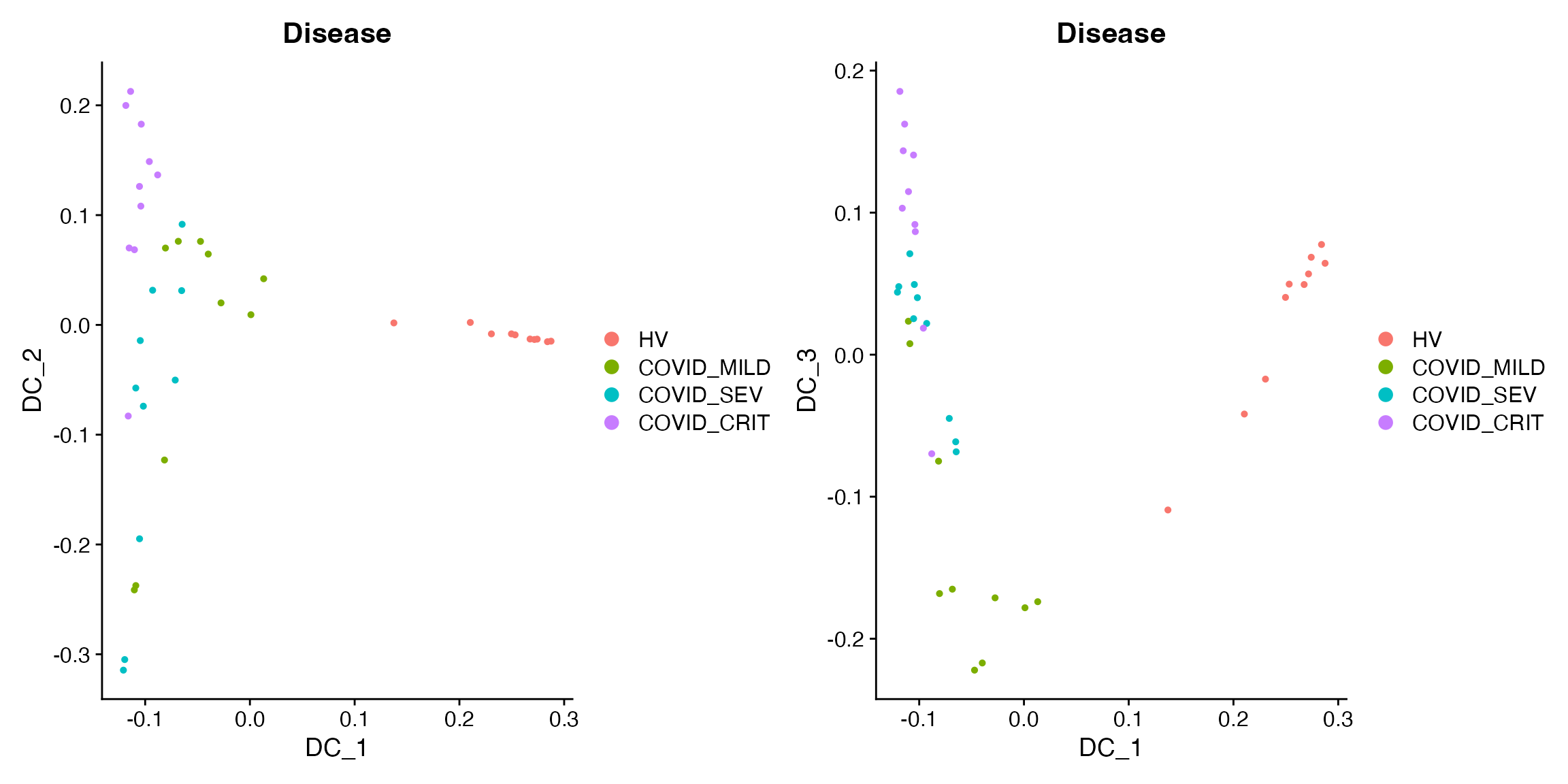
We append DC1-3 to the metadata and analyze their relationships with clinical variables.
# Append DC1-3 to the metadata
sample_obj[['traj_DC1']] = sample_obj@reductions$DiffMap@cell.embeddings[, 1]
sample_obj[['traj_DC2']] = sample_obj@reductions$DiffMap@cell.embeddings[, 2]
sample_obj[['traj_DC3']] = sample_obj@reductions$DiffMap@cell.embeddings[, 3]
The following plots show that DC2 is related to TimeSinceOnset and DC3 is related to severity:
# Showing DC2 is related to TimeSinceOnset and DC3 is related to severity
p1 = FeatureScatter(sample_obj,
               feature1 = "traj_DC2",
               feature2 = "TimeSinceOnset",
               group.by = "Disease",
               cells = colnames(sample_obj)[sample_obj$Disease != "HV"],
               pt.size = 2)

p2 = ggplot(sample_obj@meta.data[sample_obj$Disease != "HV", ]) +
  geom_density_ridges(aes(x = traj_DC3, y = Disease, fill = Disease), scale = 0.9) +
  theme_minimal() +
  theme(title = element_text(hjust = 0.5, size = 15),
        text = element_text(size = 13),
        axis.text.x = element_text(hjust = 1, vjust = 1, angle = 45),
        axis.text = element_text(size = 13))
print(p1 + p2)
#> Picking joint bandwidth of 0.0287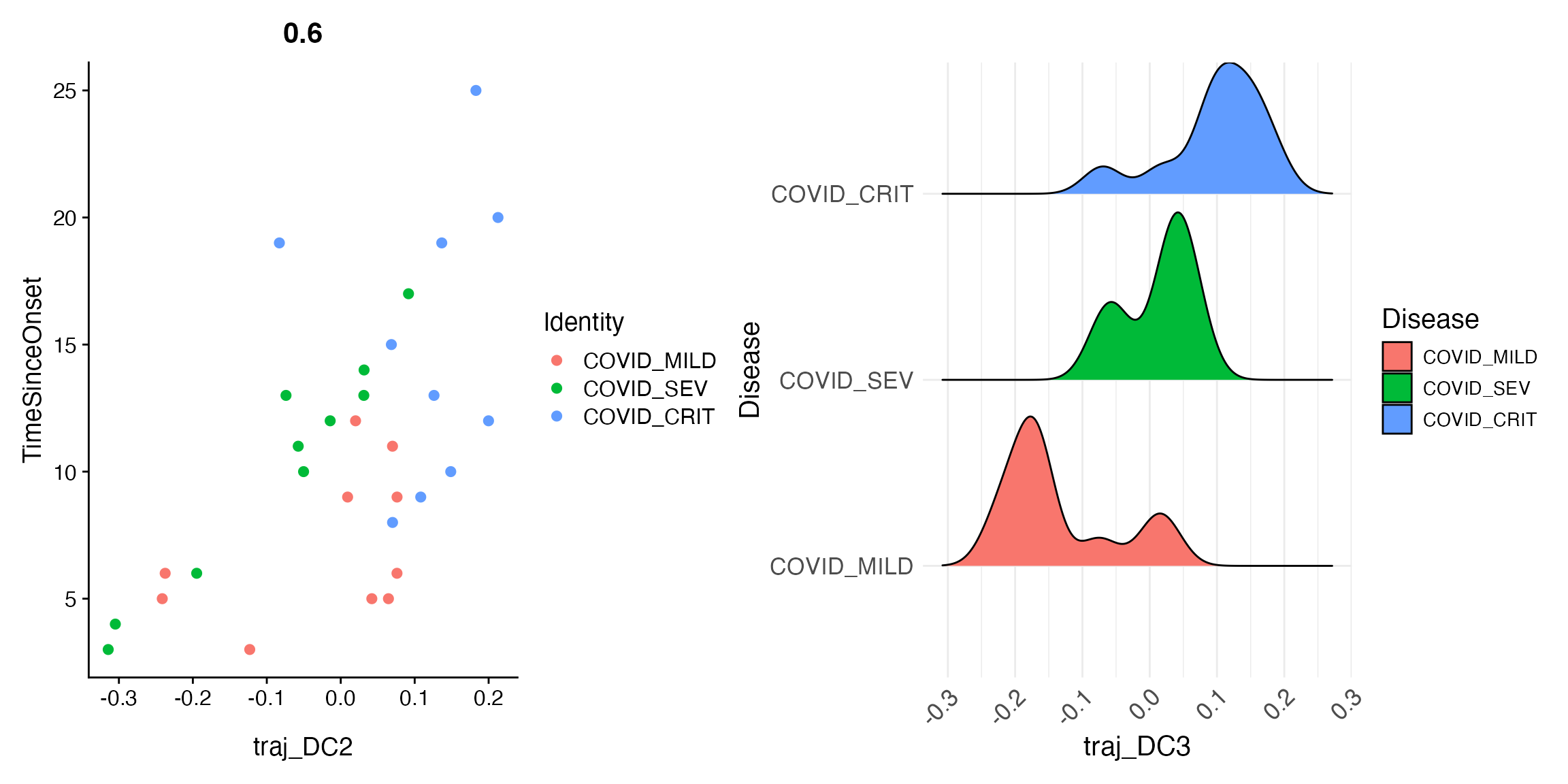
Fitting a joint pseudo-trajectory using principal curve
Principal Curve Fitting
If you want to explore if multiple DCs can be merged together, we can also fit a principal curve to the top few DCs to obtain a joint pseudo-trajectory line. Here we are fitting such curve for the top 2 DCs, and append it to the object.
princurve_res = princurve::principal_curve(sample_obj[['DiffMap']]@cell.embeddings[, 1:2],
                                           plot = F, maxit = 20, trace = T)
sample_obj[['traj_overall']] = princurve_res$lambda
DimPlot(sample_obj, reduction = "DiffMap", group.by = "Disease")  +
  geom_path(aes(x = princurve_res$s[princurve_res$ord, 1], y = princurve_res$s[princurve_res$ord, 2]))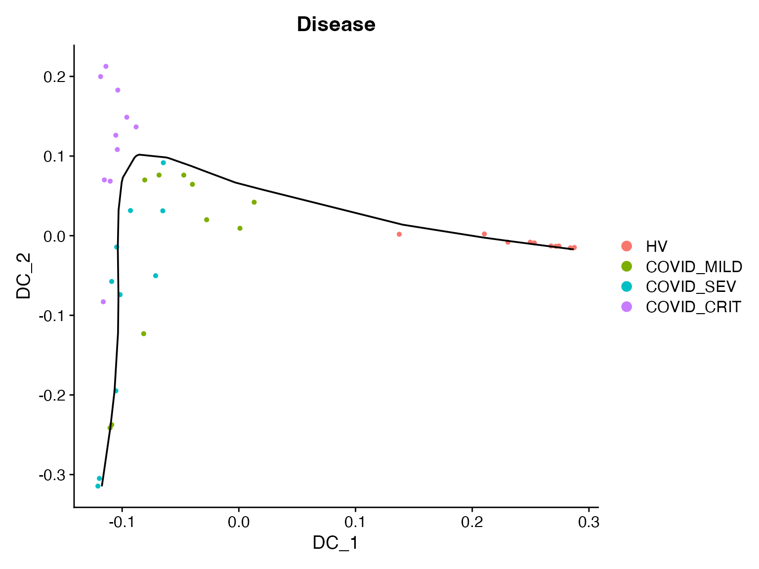
Differential Expression Analysis Setup
Finally, we can perform differential expression (DE) analysis to extract differentially expressed genes (DEGs) that change along the pseudo-trajectory we inferred. We will do this for each individual DC separately, since we believe they represent 3 different biological variations.
First, we need to obtain the pseudobulked expression data for the original single-cell data:
bulk_obj = AggregateExpression(object, assays = "RNA", group.by = c("Donor", "azimuth_label"), return.seurat = T)
#> Centering and scaling data matrix
# Append the metadata to pseudobulked object
mdata = object@meta.data[, c("Donor", "azimuth_label")]
mdata = mdata[!duplicated(mdata), ]
rownames(mdata) = paste0(gsub(pattern = "_", replacement = "-", mdata$Donor),
                         "_",
                         gsub(pattern = "_", replacement = "-", mdata$azimuth_label))
bulk_obj = AddMetaData(bulk_obj, metadata  = mdata)

bulk_obj$nCount_RNA = colSums(x = bulk_obj, slot = "counts")  # nCount_RNA
bulk_obj$nFeature_RNA = colSums(x = LayerData(object = bulk_obj, layer = "counts") > 0)  # nFeature_RNA
DE Analysis for CD14 Monocytes
Then we run DE analysis for one cell type at a time. We will use “CD14 monocytes” as an example.
sub_bulk_obj = subset(bulk_obj, subset = azimuth_label == "CD14 monocyte")

# Add metadata from sample-level object to pseudobulk object
new_mdata = merge(sub_bulk_obj@meta.data[, c("Donor"), drop = F],
                  sample_obj@meta.data[, c("Donor", "Age", "Sex", "Disease", "traj_DC1", "traj_DC2", "traj_DC3")],
                  by = "Donor",
                  all.x = T,
                  sort = FALSE)
sub_bulk_obj = AddMetaData(sub_bulk_obj, metadata = new_mdata)
sub_bulk_obj$log_count = log10(sub_bulk_obj$nCount_RNA)
We can now run trajectory DE tests for DC1, DC2, and DC3, respectively. Note that we will remove healthy donors when focusing on DC2/3 to better focus on within-COVID heterogeneity.
# Run trajectory DE test for DC1
de_results = TrajDETest(sub_bulk_obj, assay = "RNA", layer = "counts",
                        traj.var = "traj_DC1", latent.vars = c("Age", "Sex", "log_count"))

# Run trajectory DE tests for DC2 and DC3
non_health_idx = Cells(sub_bulk_obj)[sub_bulk_obj$Disease != "HV"]
de_results2 = TrajDETest(sub_bulk_obj, assay = "RNA", layer = "counts",
                         traj.var = "traj_DC2", latent.vars = c("Age", "Sex", "log_count"),
                         samples = non_health_idx)

de_results3 = TrajDETest(sub_bulk_obj, assay = "RNA", layer = "counts",
                         traj.var = "traj_DC3", latent.vars = c("Age", "Sex", "log_count"),
                         samples = non_health_idx)
Now, for the DE results, we will identify the top up- and down-regulated DEGs for visualization:
# Identify the top up- and down-regulated DEGs for visualization
de_results$sign = sign(de_results$beta_Traj)
de_results = de_results[order(de_results$sign, de_results$p_Traj), ]
DEG_DC1 = c(de_results$gene_ID[de_results$sign > 0][1:20],
            de_results$gene_ID[de_results$sign < 0][20:1])

de_results2$sign = sign(de_results2$beta_Traj)
de_results2 = de_results2[order(de_results2$sign, de_results2$p_Traj), ]
DEG_DC2 = c(de_results2$gene_ID[de_results2$sign > 0][1:20],
            de_results2$gene_ID[de_results2$sign < 0][20:1])

de_results3$sign = sign(de_results3$beta_Traj)
de_results3 = de_results3[order(de_results3$sign, de_results3$p_Traj), ]
DEG_DC3 = c(de_results3$gene_ID[de_results3$sign > 0][1:20],
            de_results3$gene_ID[de_results3$sign < 0][20:1])
Heatmap visualization for DC1 (donors are ordered based on DC1):
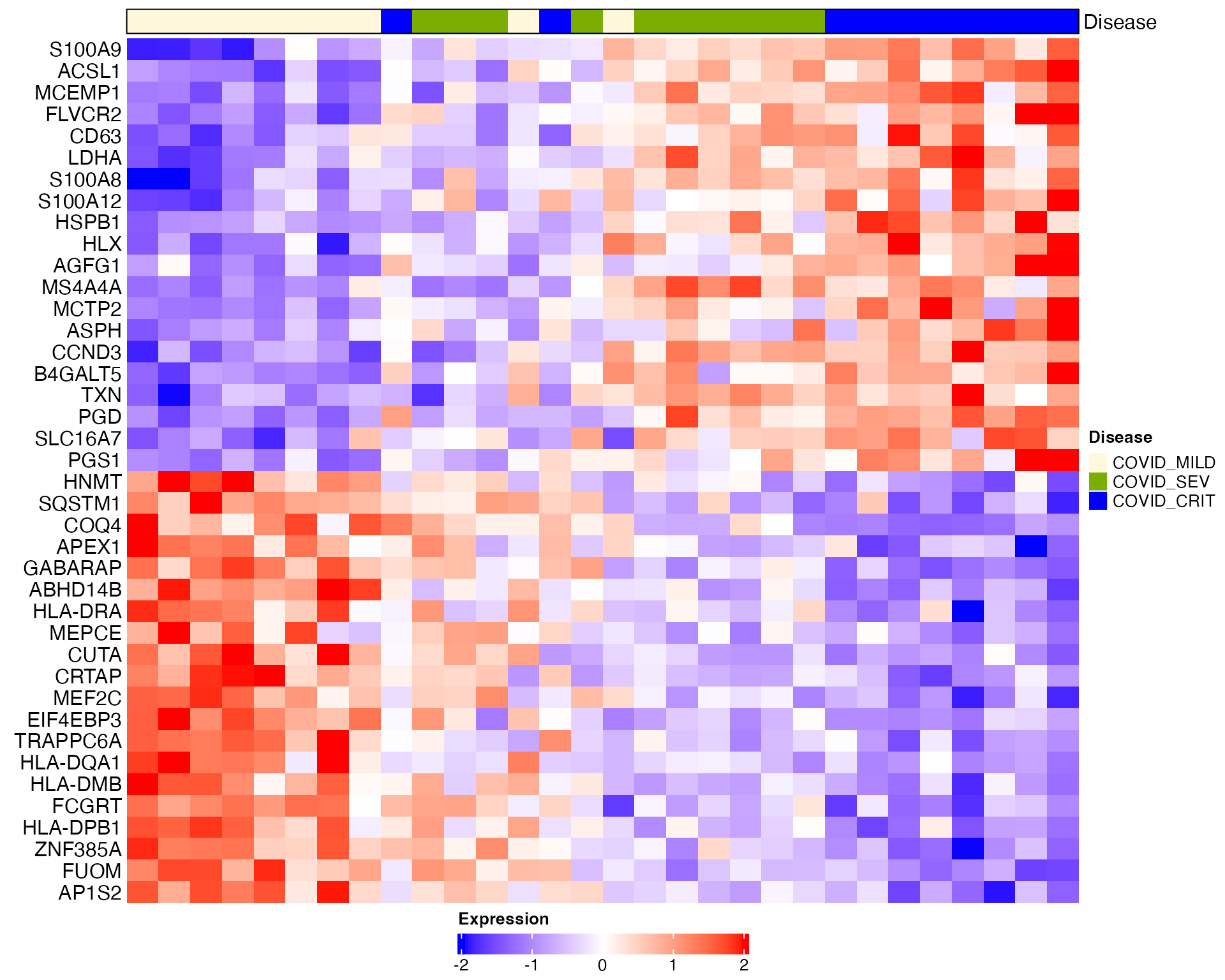
# Heatmap visualization for DC1 (donors are ordered based on DC1)
sub_bulk_obj = ScaleData(sub_bulk_obj, features = DEG_DC1)
Scillus::plot_heatmap(dataset = sub_bulk_obj,
                      markers = DEG_DC1,
                      sort_var = "traj_DC1",
                      anno_var = c("Disease"),
                      anno_colors = list(c("#f8766d", "cornsilk", "#7cae02", "blue1", "#01bfc4", "#c77cff" )),
hm_colors = c("blue","white","red")) 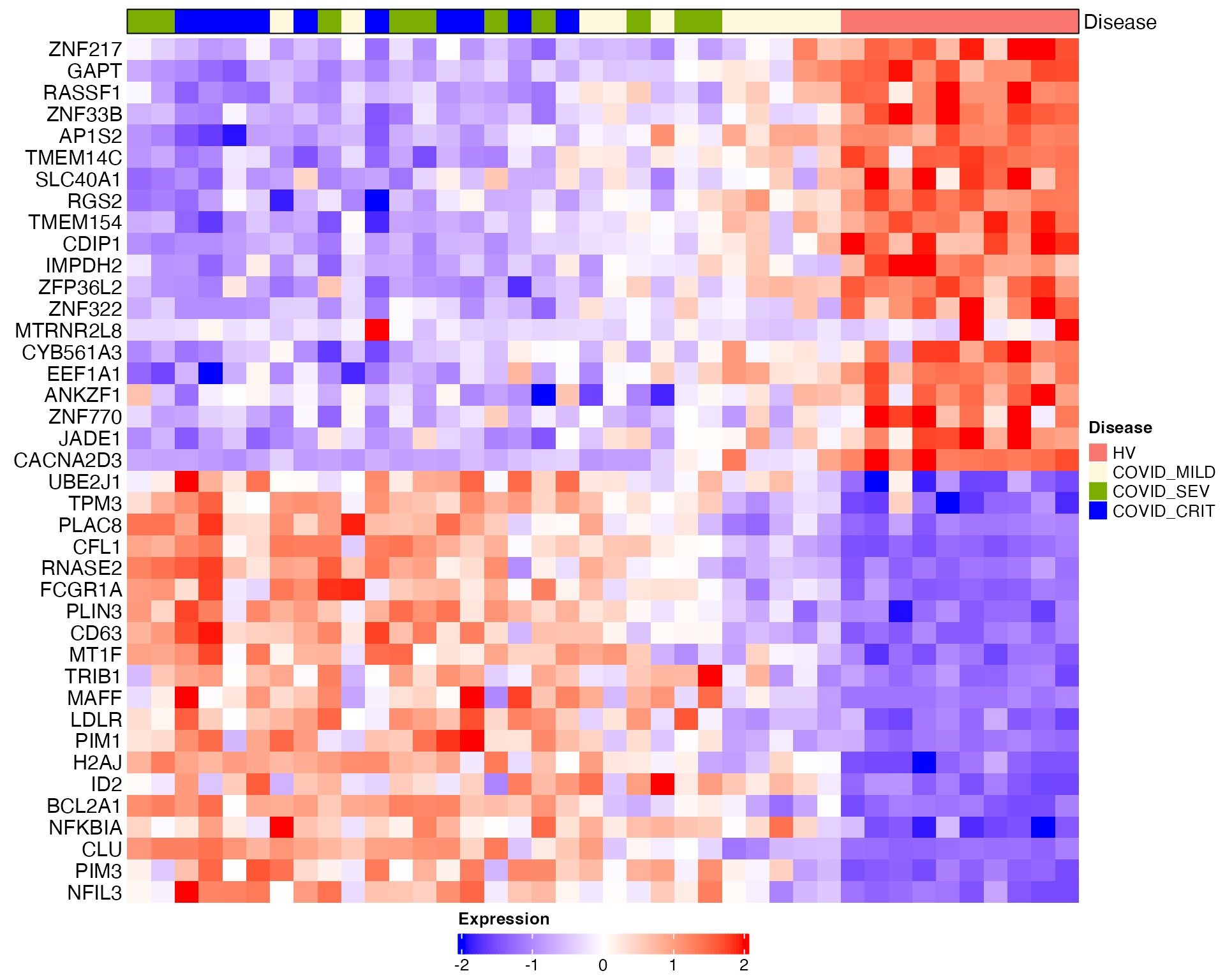
Heatmap visualization for DC2 and DC3 (healthy donors are removed):
# Heatmap visualization for DC2 and DC3 (healthy donors are removed)
sub_bulk_obj2 = subset(sub_bulk_obj, cells = non_health_idx)
sub_bulk_obj2 = ScaleData(sub_bulk_obj2, features = c(DEG_DC1, DEG_DC2, DEG_DC3))
Scillus::plot_heatmap(dataset = sub_bulk_obj2,
                      markers = DEG_DC2,
                      sort_var = "traj_DC2",
                      anno_var = c("Disease"),
                      anno_colors = list(c("cornsilk", "#7cae02", "blue1", "#01bfc4", "#c77cff" )),
hm_colors = c("blue","white","red")) 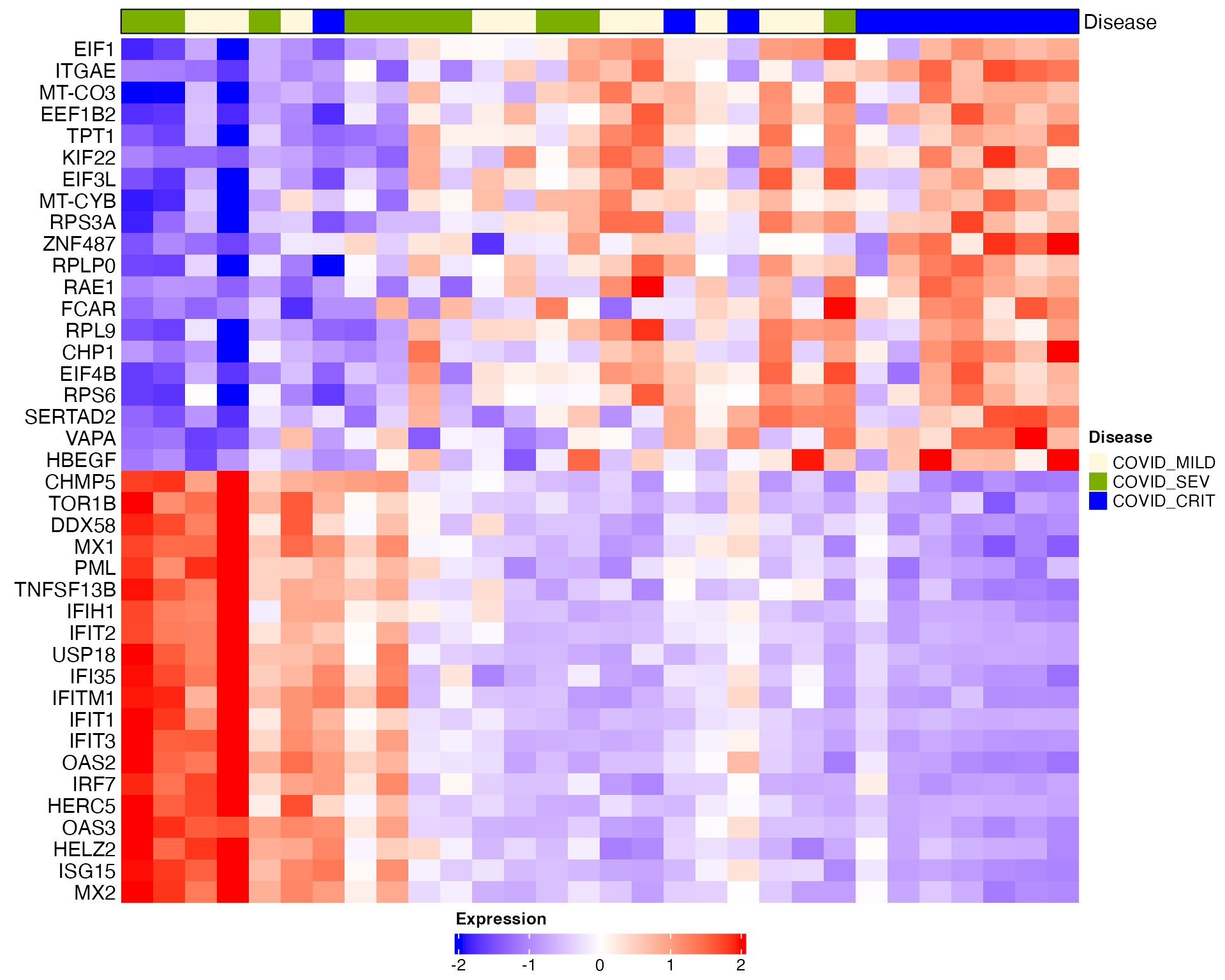
Scillus::plot_heatmap(dataset = sub_bulk_obj2,
                      markers = DEG_DC3,
                      sort_var = "traj_DC3",
                      anno_var = c("Disease"),
                      anno_colors = list(c("cornsilk", "#7cae02", "blue1", "#01bfc4", "#c77cff" )),
                      hm_colors = c("blue","white","red"))